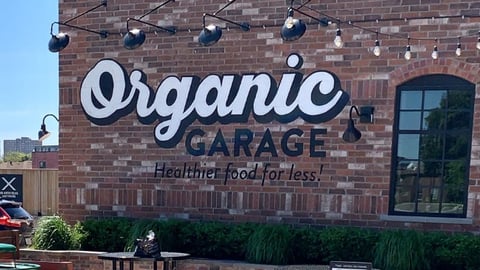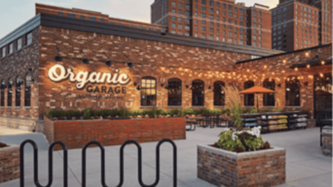
Organic Garage unveils a new logo

Organic Garage Ltd. has updated its logo after an extensive review of its branding in anticipation of a planned store expansion strategy.
According to Organic Garage, the new logo’s simplified bold font better expresses the company’s value proposition and is easy to create and apply to new locations.
The down arrow with a price symbol will be a message carried throughout the store. The company will start updating the logo at its existing stores and in its media assets and flyers over the next six months.
“I am really pleased with the updated logo,” said Matt Lurie, president and CEO of Toronto-based Organic Garage. “We received a lot of interest in our recently stated expansion plans and the volume of proposed sites for new stores is significant. We felt that it was important for us to refine how we communicate to potential new customers and, as the logo is the first thing customers see, we wanted something that would reinforce our value statement.