
Pot of Gold unveils new look for key sales period
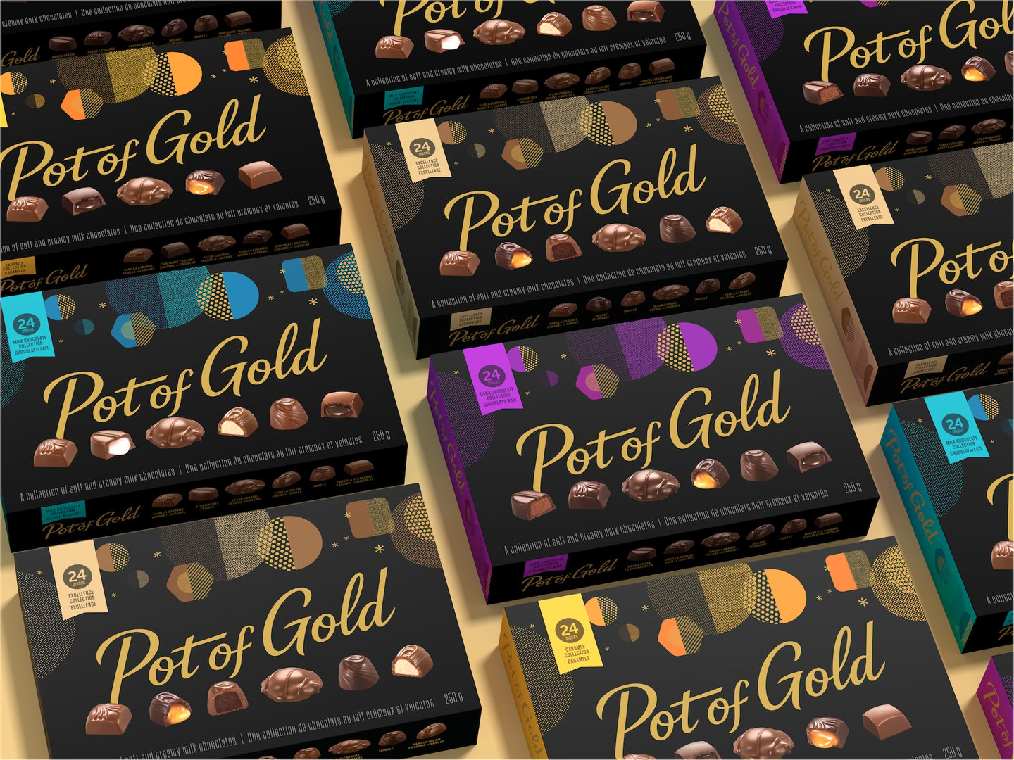
The Hershey’s chocolate brand Pot of Gold has introduced packaging for the Canadian and U.S. markets designed to convey a sense of “premium-ness” and broaden its appeal during a key sales period.
Developed by Pigeon Brands, the new packaging is designed to maintain the brand’s appeal among its loyal 55+ customers, while displaying a contemporary look and feel specifically designed to appeal to consumers 25+.
“We want to dust off the impression [of Pot of Gold] as something my parents would buy, and give it a younger appeal,” says Katie Rothschild, vice-president of client services for Pigeon Branding in Toronto. “[We wanted] to make it lively, more contemporary and create mass appeal.”
Rothschild says because Pot of Gold doesn’t benefit from extensive consumer marketing, it is heavily reliant on its shelf presence to stand out. “It needs to work really hard at shelf-level,” she says. “This category has become hyper-competitive, and they were really looking to create that distinction from the rest of their competitive set.”
The rebrand is being accompanied by the Canadian debut of some formerly U.S.-only SKUs, including a Dark Chocolate Collection.
While the brand has retained its signature black packaging in Canada (it uses seasonal colouring in the U.S.) the rebrand includes gold embellishments to create a more premium feel, as well as a new colour-coding system on the top and sides of the packaging designed to help consumers navigate its expanded product assortment at shelf-level.
The Excellence Collection of milk chocolates is marked by a new gold colour, for example, while the Dark Chocolate Collection is presented using purple, and the Milk Chocolate Collection uses blue.
The boxes also feature geometric shapes at the top that loosely reflect Christmas ornaments (while Pot of Gold is available other times of the year, such as Valentine’s Day, the majority of its sales are in December, says Rothschild), but can also be interpreted in other ways—such as the night sky and the chocolates themselves—for those who don’t celebrate the holiday.
“The design for Canada is meant to be evergreen and [suitable] for any gifting occasion,” says Rothschild.
Pigeon also updated the chocolate photography on the box to make them more appealing and create what is described as a “jewel-like” offering, and changed the previously heavily stylized Pot of Gold script font on the packaging to be more contemporary in nature.
“It was very outdated, old-fashioned, cursive type of writing,” says Rothschild. “Creating something that was scripted but not fully cursive, is just a small trick to make it more contemporary.”