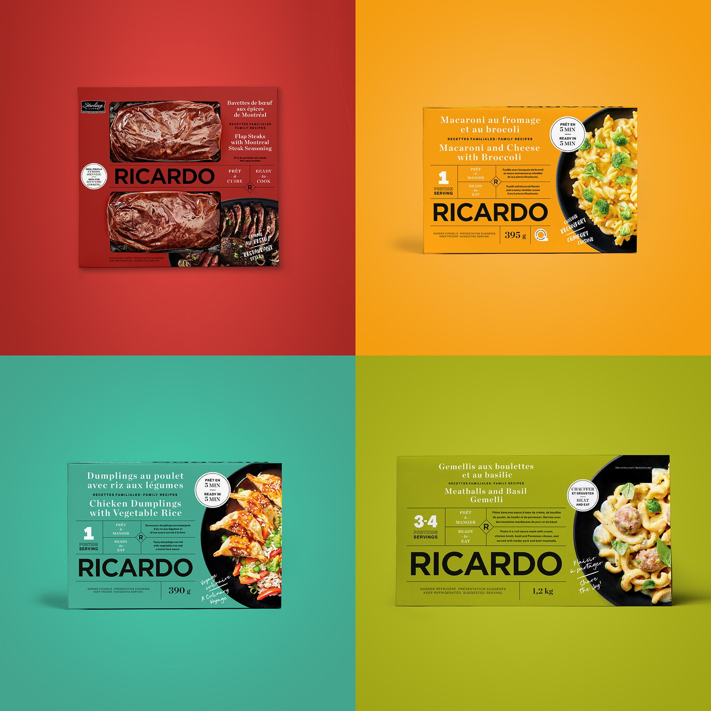
Ricardo introduces revamped packaging
Quebec grocery brand Ricardo has partnered with design agency Pigeon to create a new visual identity for its line of grocery products. The revamped products will be rolled out over the next several weeks.
The company said the visual update is intended to reflect the brand personality and make its products more impactful and easier to discover on grocery store shelves.
Ricardo enlisted Pigeon—whose roster of design clients includes Hershey Canada, Dempster’s and Danone—to conduct an in-depth analysis of its packaging last winter. It found that despite possessing what it describes as “refined aesthetics,” the products didn’t stand out enough in the various categories in which they compete.
Its current product roster includes cooking and stir-fry sauces, as well as individual frozen meals such as General Tao Meatballs and Pesto Shrimp Pasta, and ready-to-cook items including Mediterranean-Style Chicken Breasts and Flap Steaks with Montreal Steak Seasoning.
“We have so many products across different categories and needed to better reflect the brand personality and have the same image across all the products to have them stand out on the shelf,” says Mireille Arteau, vice-president of operations for Ricardo parent Ricardo Media. “It’s more authentic, colourful and appealing, and it creates interest.”
The brand revamp includes a new colour palette using what the brand describes as “corn yellow,” “leek green” and “cranberry red,” all specifically designed to catch shoppers’ eyes and connect with them through a “warm and inviting spirit.” The packaging also features quotes from Ricardo founder Ricardo Larrivée and his team, such as “Feel like a culinary voyage,” “Dinner with no dishes tonight” and “Share the joy.”
“One of the key objectives of the redesign was to create a coherent platform from one category to the next, to better create interest and desire, as well as generate attention and give people a taste for Ricardo products,” says Pigeon’s VP brand strategy Stéphane Crevier. “The ultimate goal? Ending up on Canadians’ weekly grocery lists.
“To achieve this, we created appetizing imagery inspired by their dishes, and employed a lively palette of colours to ignite taste, while increasing visibility and contrast in all categories the products can be found.”
IGA acquired a majority interest in Ricardo Media last month, with Sobeys/IGA executive vice-president and chief operating officer Pierre St-Laurent telling Canadian Grocer at the time that the approximately two-year-old food brand figures prominently in the company’s plans.
“We’re using [Ricardo] to differentiate,” he said. “It’s a complementary product [to the company’s existing private-label brand Compliments] that’s very powerful and distinctive…and we believe that in some parts of the country, some of these products could be really well received.”
Ricardo currently has about 30 products on shelves in Quebec IGA stores, with another 25 launching this fall and approximately 40 in development, says Arteau. “The food development strategy is targeted towards families,” she says. “Our mission is to inspire, educate and gather people around the table to cook and eat together.”


