Little Potato Company unveils new brand identity
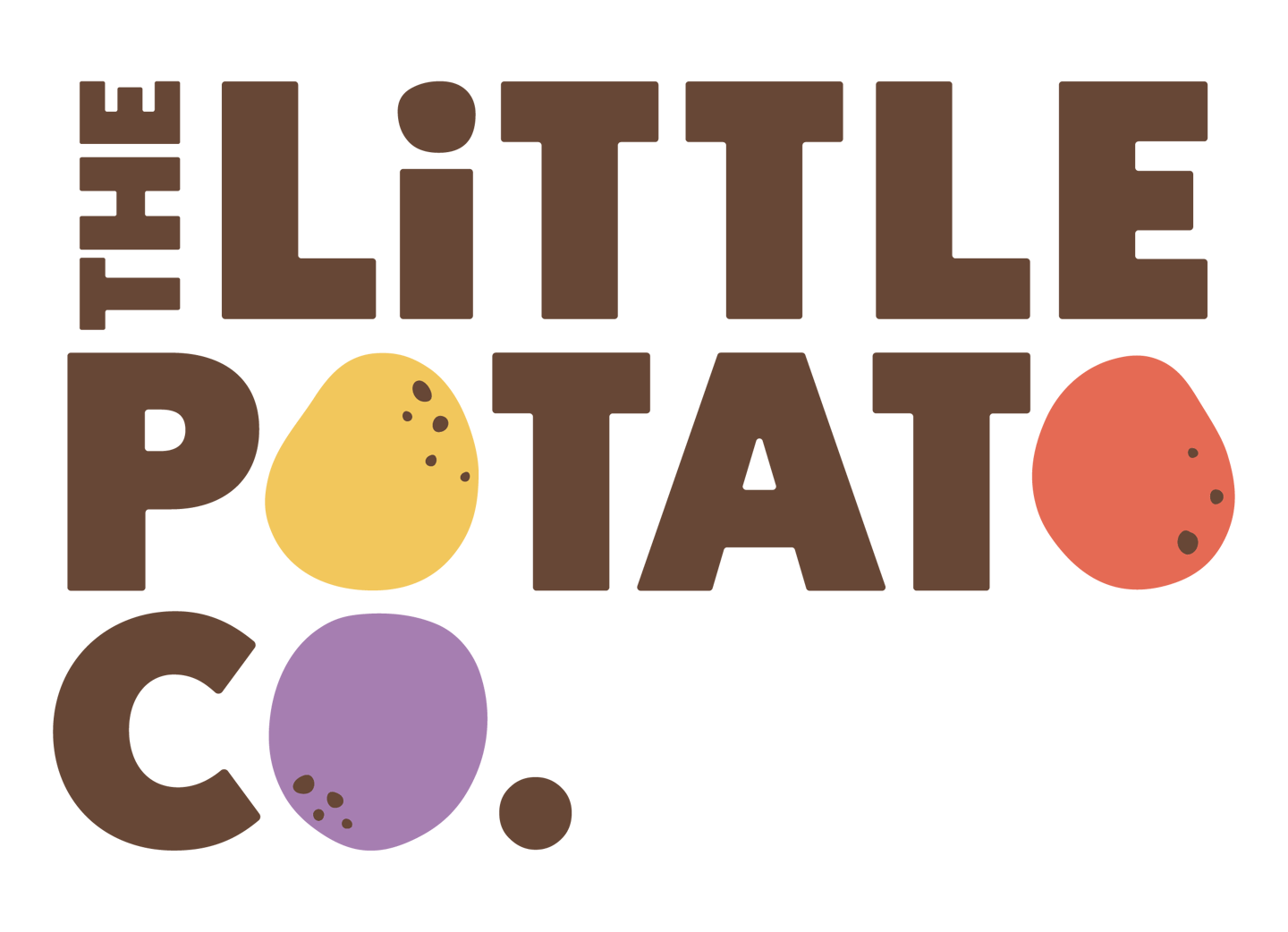
The Little Potato Company has refreshed its brand identity, rolling out a new logo and redesigned packaging.
With a focus on busy families in search of quick and easy meal solutions, the rebrand includes new “family-friendly” packaging with updated product names, new brand characters, a refreshed website and social channels and a digital ad campaign.
The packaging now highlights the product’s perks – like limited prep and cooking time – and cooking methods.
Additionally, it includes a message from the brand’s father-and-daughter founders and sustainability messaging about the farms.
The refresh includes simplified product names with the prefix “little,” to reinforce the branding and highlight the size of potatoes, along with the color/varietal or flavor
New brand characters are also featured on the pack. The “Spuddies” are yellow, red and purple potatoes who share messages like “enjoy the little things,” “fresh from our family farms,” and “a little win for a busy night at home.”
Starting March 28, the brand refresh will be supported by a digital ad campaign running across North America featuring videos of the Spuddies sharing dinnertime wisdom.
“We did extensive research to deeply understand our consumers, and what they care about is feeding their families with healthy, easy meals and finding moments of connection and joy together. We refreshed the brand with a new brand promise, to bring little moments of happiness to busy families,” said Angela Santiago, CEO and co-founder of The Little Potato Company, in a statement. “We bring that to life in every element of our relaunch, from the colorful logo, to our characters, and our heartwarming ad campaign.”


