Senior designer Sarah Luker on the importance of timeless store design

A grocery store is more than a place to stock the pantry—it’s a touchpoint for the community. It’s where your customers run into their neighbours and staff knows them by name; it’s a place to meet friends for coffee or lunch. Thoughtful store design plays a key role in that. We spoke to Sarah Luker, senior designer at King Retail Solutions in Eugene, Ore., about creating timeless, community-driven retail spaces that keep shoppers lingering—and spending. This interview has been edited for clarity and length.
How do you design for community rather than just utility?
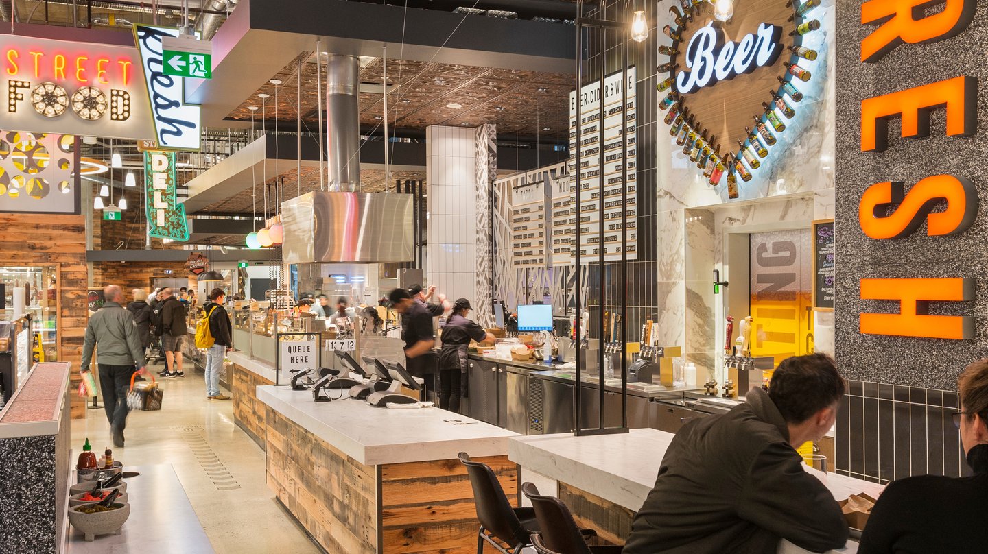
A lot of it depends on the retailer and what they want to do. A big part of it is [creating] space to “be” and not just shop, which tends to translate to seating areas and cafe areas or other interaction areas. The key is flexibility; these spaces shouldn’t sit empty—an empty dead space is such a bummer. You want to make sure you’re prioritizing your foodservice program and your grab and go in a way that allows you to sell a good quality product and compete with quick-service restaurants. Even as people are being more price conscious, they’re still wanting convenience and wanting good quality food in a low-stress place. So, places where [customers] can have privacy without increasing the risk of theft; places that are still visible but offer a perceived sense of privacy. Think about how long you want your shoppers to linger in this space and then provide seating that reflects that. Have a coffee area that also functions as a quick-serve restaurant with paninis and grab-and-go items. This area should be supported by the larger grocery program so shoppers can engage with the product. We have one client who put in more than one seating area: there’s a seating area to support their coffee shop and quick serve, and a small seating area closer to the deli. They even brought in meat smoking and carving stations and, so far, it’s proving successful.
How are you adapting store design to specifically cater to the value-seeking shopper? What architectural shifts are most effective at making a discount environment feel intentional rather than just budget?
It’s a tricky dance. It can be easy to go too far and oversimplify the environment, making it unpleasant or too sterile [and] unfinished. You still want to create a space that has texture, depth, interest and human connection. Some of the most successful “value-focused” stores develop a more uniform look by using consistent department headers, colours and materials, rather than a boutique “store-within-a-store” approach. A cohesive theme can reinforce the retailer’s commitment to value.
Lean into timeless design rather than the latest trendy look. In most cultures, good, affordable, salt-of-the-earth food is associated with the past and traditions. They come from our grandmothers, mothers, aunties and uncles, the greasy spoon, neighbourhood vendors, community gatherings. I’m not suggesting you embrace purely traditional esthetics or avoid contemporary designs; focus on creating spaces that are as relatable as good-quality, affordable foods. Design to fit your location and community and what they love and feel comfortable with.
How can grocers deliver both a "mission shop" and an "experience shop" under one roof?
Well, one, I recommend working with strategic partners who know the industry well and can be sounding boards for you. Not to promote design, but we think about this and get to see a lot of different strategies often. Observe what other people do and what spaces work well. Check out your competition, check out places that are adjacent but not your direct competition. Evaluate quick service restaurants—go with your team, sit and see how they feel, see how they flow and really pay attention to what products people are gravitating towards. Just observe.
How can underperforming areas be reimagined to drive incremental revenue?
Well, first, you need to observe how that space is working. See how people use the space and really try and pay attention to what’s going on. Figure out how to bring merchandising into that space— in a way that doesn’t encourage people to pickpocket—where they can see the product and be enlivened by it, which is why I love having floral closer to a cafe space because plants are always nice. And they’re not plants that you have to take care of on a regular basis and keep clean; they’re regularly changing over.
What is a common layout misstep that can limit a grocer’s revenue potential?
Not having enough prep space that works. You can have a huge back of house and not enough sales floor, or you can have a teeny, tiny back of house that doesn’t give you room to store anything. Make sure you’re taking advantage of your square footage. It’s always going to be a calculation and a back and forth to figure out the right balance, but it’s important to treat prep space as an opportunity to tell a story. It’s not always the best strategy to keep a prep space hidden. Keep it looking attractive and think of it as a visual destination. It’s better to support a food program well than to have an extra rack of bread.
Which design trend do you think is overrated?
Polished concrete floors—they take a lot of maintenance and they stain easily. It’s expensive to install, it’s expensive to maintain and it’s not great for the environment. Every time you polish a [concrete] floor, you have to use these terrible stripping agents to remove the wax, so it’s bad for the environment. Almost all our clients want to use concrete floors because it’s simple and straightforward, but it’s more expensive to maintain and it’s not great for the planet.
This article was first published in Canadian Grocer’s May 2026 issue.