Spud gets a brand refresh
Vancouver-based Spud has rolled out a refreshed brand to better reflect the company’s growth and planet-focused principles.
Founded in 1998, the e-commerce grocer focuses on healthy, locally sourced groceries that are sustainably delivered. Spud, which is a Certified B Corporation, has long worked to reduce its environmental impact, fight food waste and reduce packaging – all of which is now better reflected in the brand’s crisp, clean look and feel, according to the company.
“We started off as a local CSA [community-supported agriculture company] and we’re now a full-service e-commerce grocer, so it was just time,” says Spud’s VP of marketing and communications, Arndrea Scott, on the reason for the refresh.
The new brand identity includes a modernized green logo with the tagline “Local and sustainable groceries delivered,” and a secondary word mark that conveys a reusable green bin, replacing an illustration of an apple.
“The apple didn’t tell [the full] story of Spud as a grocer,” says Scott. “We now have more than 10,000 items on our site, and we wanted to tell the e-commerce service side of the story… It’s the same trusted service, just with a fresh look to show how much we’ve grown over the years.”
[Read more: “SPUD.ca creates recipes using imperfect fruit to help address food insecurity”]
In customer focus groups conducted to inform the refresh, the bin was something that resonated with participants, says Scott. “The bin is a big part of the equation to them: When they think of Spud, they think of the bin.”
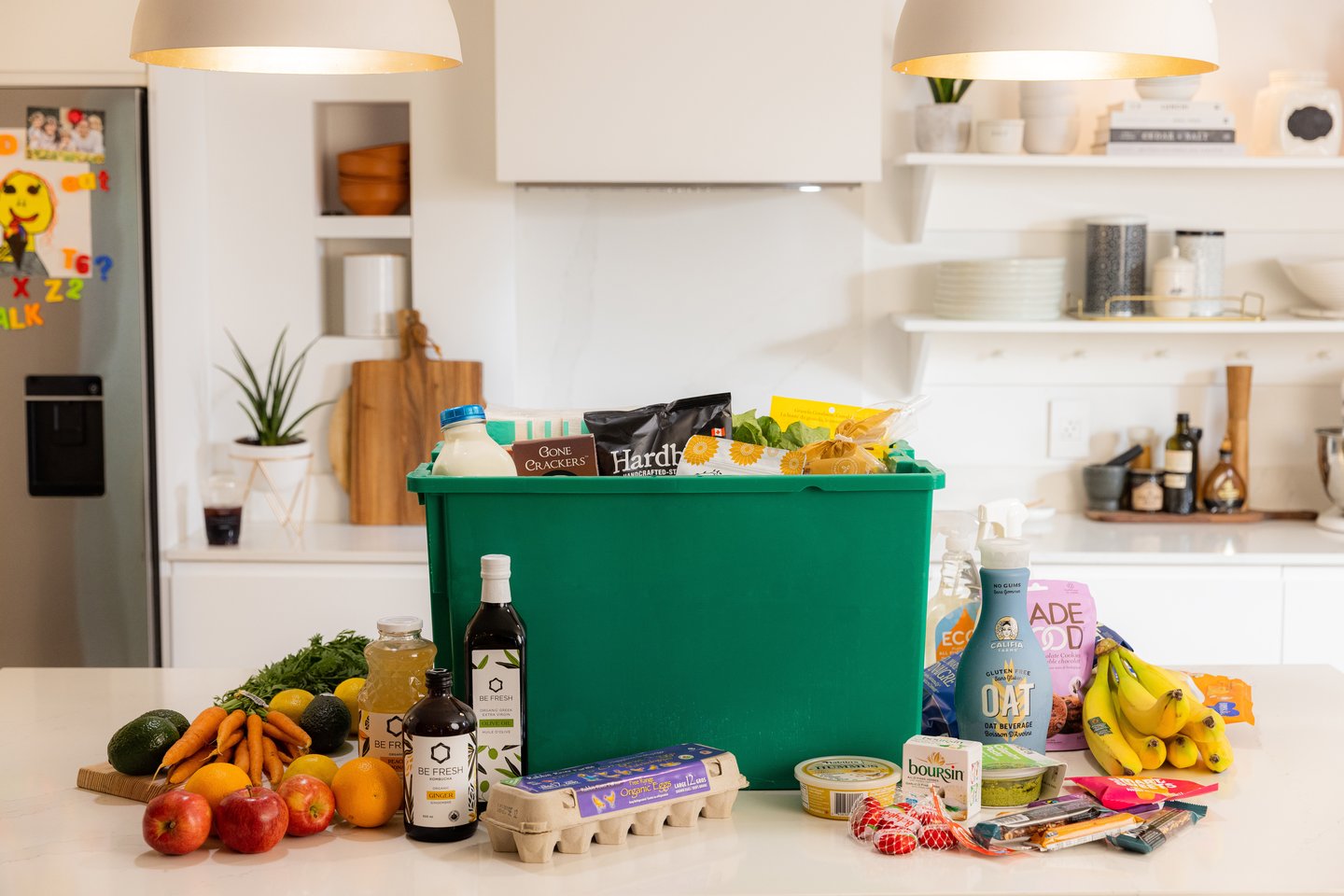
Spud’s groceries are delivered to customers in reusable bins and “bins are a model of sustainability,” she explains. And with the colour green being a symbol for sustainability as well, customers also felt green was a strong colour to tie back to Spud.
The bin shows up in various places such as the profile picture on Spud’s social media pages. It also replaces the little shopping cart icon found on the top right-hand side of the e-commerce site.
[Read more: “What's up with e-comm?”]
Authenticity is another key piece of the refresh. In photographs and illustrations of food items, Spud is trying to convey a sense of real life with things like cookie crumbs. “When you’re in the kitchen cooking, it’s not this perfect moment,” says Scott. “There are crumbs on the floor, flour on the counter, or you’re covered in tomato sauce. Customers really resonated with the idea of showing that authenticity – what happens when you use food and how food shows up in our lives.”
To spread the word about the updated branding, Spud ran a giveaway on social media and has created a fun video showing the evolution of the brand. It has also let customers know about the change through email and the website. Social media influencers are also helping spread the word, says Scott.
“The feedback has been so positive,” says Scott. “Everybody we’ve spoken to has said it was the right time and the right move, and the look really resonates with them.”